UI Elements > General Elements
-
My Income $47,171
-
Site Traffic 45%
-
Site Orders 2447
Customized Tabs
Accordions
Default Nav Bars
Labels and Badges
Did you know you can add more than just the basic colors to customize your badge? Learn more about color options modifiers on the Typography page!
Add any of the below mentioned modifier classes to change the appearance of a label.
| Classes | Labels |
|---|---|
.label-default
|
Default |
.label-primary
|
Primary |
.label-success
|
Success |
.label-info
|
Info |
.label-warning
|
Warning |
.label-danger
|
Danger |
Add any of the below mentioned modifier classes to change the appearance of a badge.
| Classes | Badges |
|---|---|
| No modifiers | 42 |
.bg-color-darken
|
1 |
.bg-color-greenLight
|
22 |
.bg-color-blueLight
|
30 |
.bg-color-orange
|
412 |
.bg-color-red
|
999 |
Block Messages
Warning!
Best check yo self, you're not looking too good. Nulla vitae elit libero, a pharetra augue. Praesent commodo cursus magna, vel scelerisque nisl consectetur et.Success!
Best check yo self, you're not looking too good. Nulla vitae elit libero, a pharetra augue. Praesent commodo cursus magna, vel scelerisque nisl consectetur et.Info!
Best check yo self, you're not looking too good. Nulla vitae elit libero, a pharetra augue. Praesent commodo cursus magna, vel scelerisque nisl consectetur et.Error!
Best check yo self, you're not looking too good. Nulla vitae elit libero, a pharetra augue. Praesent commodo cursus magna, vel scelerisque nisl consectetur et.Carousel Slide / Fade
Carousel
.slide
Default sliding carousel with base class of
.carousel .slide
Carousel
.fade
To make the carasoul fade, you can use the class
.carousel .fade

Title 1
Cras justo odio, dapibus ac facilisis in, egestas eget quam. Donec id elit non mi porta gravida at eget metus. Nullam id dolor id nibh ultricies vehicula ut id elit.
Read more

Title 2
Cras justo odio, dapibus ac facilisis in, egestas eget quam. Donec id elit non mi porta gravida at eget metus. Nullam id dolor id nibh ultricies vehicula ut id elit.
Read more

A very long thumbnail title here to fill the space
Alerts and Notifications
Bootstrap Modal
Static Example
A rendered modal with header, body, and set of actions in the footer.
Live Demo
Toggle a modal via JavaScript by clicking the button below. It will slide down and fade in from the top of the page.
Options
Smart Notifications with sound
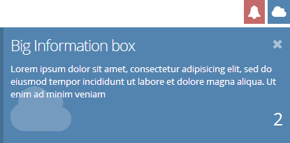
Big box (Static Example)
Clutter free dynamic alert box, easy to configure and setup!
Sound Enabled

Live Demo
INFO! Messages are tabbale and does not overpopulate the user screen. Sounds can also be disabled if not needed
Small box alert
Easily customize the alerts to any colors of your choice, and add any icons from the theme library with animation!
Extra Small Box
Go even tinier with smaller attention messages!
Smart Alert with sound
With Callback and Buttons (Dynamic Example)
With Input and Select
Log me in example
Tooltips and Popovers
Tooltips
Tip your users with a small tooltip. Nifty helpful information can be disaplayed using this very simple and yet effictive component. Display pure HTML Content, Images and Icons
Popovers
Popovers are a cool way to express compressed information to the user, neatly and quickly. You can generate all kinds of content within the popover component. Including Forms, Tabs, Images and even Google map!
Containers, Media and Pagination
Jumbotron Gets your user attention!
Hello, world!
This is a simple hero unit, a simple jumbotron-style component for calling extra attention to featured content or information.
Wells Notice the well sizes
.well .well-lg
.well
.well .well-sm .well-light
Well with background
.bg-color-darken
Well with background
.bg-color-teal
Well with background
.bg-color-pinkDark
Learn more about other colors that you can use for .well by going to typography page
Media
-

Media heading
Cras sit amet nibh libero, in gravida nulla. Nulla vel metus scelerisque ante sollicitudin commodo. Cras purus odio, vestibulum in vulputate at, tempus viverra turpis.
-

Media heading
Cras sit amet nibh libero, in gravida nulla. Nulla vel metus scelerisque ante sollicitudin commodo. Cras purus odio, vestibulum in vulputate at, tempus viverra turpis.

